It was an unnoticeable comeback I have to admit, but I'm back for one last time to present a project hardly mentioned on this Blog: the Media Evaluation on Prezi.
Prezi is a program easy to use once understood, and thus it was easy enough to create a media evaluation on it that describes/sums up the entire media project (similar to this Blog, only with advanced PowerPoint features).
To navigate, you first press the more button then click the rectangle button that will transfer you to full screen, then you click on the triangles to move from slide to slide (the right one is forward and the left one is backwards), I hope you understand every aspect of it, as well as learn something new from it.
May the Hype stand down.
Friday, 6 January 2012
Sunday, 20 November 2011
The final post of this very blog.
So here we are, all this work to make a very good Media film and blog comes to a close with the strict deadline in place.
It was very hard work to make this film, with stop motion and characters to appeal to, and it was equally hard to produce this blog, with updating things at a daily basis and perfecting everything.
But I must say, this media project was absolutely worth it for it has taught me a lot of things as to how to make a great blog with structure, and how to make a good short film, plus it gave me the opportunity to make an actual movie of Rombes the Tiger.
Yep it way quite an adventure, and I hope that I settled my goal of opposing Sonic the Hedgehog as well as making a satisfying grade for this overall and satisfying media project in the end, and I think that Rombes the Tiger will agree with that himself.
May the Hype stand down and the Classic Returns.
It was very hard work to make this film, with stop motion and characters to appeal to, and it was equally hard to produce this blog, with updating things at a daily basis and perfecting everything.
But I must say, this media project was absolutely worth it for it has taught me a lot of things as to how to make a great blog with structure, and how to make a good short film, plus it gave me the opportunity to make an actual movie of Rombes the Tiger.
Yep it way quite an adventure, and I hope that I settled my goal of opposing Sonic the Hedgehog as well as making a satisfying grade for this overall and satisfying media project in the end, and I think that Rombes the Tiger will agree with that himself.
 |
| Rombes the Tiger fly away Ready to fight hype and evil another day As what goes as what we say Full of thunder and a innocent heart of clay Now needing a cup of tea, as it may |
Rombes-The Film Itself -The final film draft.
Continued from the last blog post, I needed to do some drastic modifications with my film in order to stand out more to people and the audience I need to target (as well as a few improvements needed).
In personal reference the film is compressed into five minutes leading to some instances of speaking without opening the mouth (but it could be worse like putting the front of the mouth at a side view like The Archie Sonic Comics) but I feel that people like it better at 5:00 due to it's shorter time and more tolerance to watch, so even the time has been improved (but better to be informed correctly that it was 5:00 instead of 6:30)
The modifications asked and mentioned from the earlier post became worth it, as the music has got allot more action, colour and variety into it (like not re-using the same Rombes Melody all the time), the sound effects have a direct rule as to what is suppose to be used at this moment and is repetitiveness is less noticeable (which makes Zoltan give out a imitating Laser sound and a lower Laser sound and Rombes an Old Telephone sound and a Electricity sound), the voice acting has been improved and refined to a better and convincing standard which adds better acting and more intention to what the characters are suppose to sound like (like Rombes being innocent and Zoltan being arrogant, and the timing of the action sequences has been sped up which leads to more momentum and more suspense at the same time which is what films like this one sometimes convey (Like the Megaman TV Series).
Also what I gave out was information of the master plan, which may make Zoltan stupid, but displays his arrogance perfectly at the same time (complete with the reason why he spurted it out in the first place).
Well that is allot of mouthful for a short film, but all this makes me improve my skills for the future, and thus say that it is really entirely worth it the whole media project.
May the Hype stand down.
Rombes-The Film Itself -The film draft.
Here it is,one of the final pieces of the puzzle to be made a necessary information, The Draft of the film that was first shown to the media boss.
If you remember from the Previous post, then you should know that this is the 6:30 version that was first produced but then reduced to five minutes (which leads in turn to the final draft of the movie), the reason for the general reduction was poor information passing from the media bosses, and I got very angry with that due to the fact that I was dependent and formulating on that time frame which leads the 5:00 version being a bit compressed (with characters talking without opening their mouths, and the factor that things got a bit faster).
Also if you hear of "the master plan" in this film, the factor is that Zoltan is suppose to be a unique clever villain that is not suppose to reveal anything, but the test audience has a poor stubborn reaction due to the fact that Zoltan did not explain it, so I have no choice by to change him to a bit more of a classical stupid villain as a result (the not revealing of the master plan was intentional for suspense and curiosity at the same time too).
But despite the lower amount of minutes, I think that a few things needed to to changed in the first place, especially when it comes to the music (which is almost lacking in this version), the sound effects (which are repetitive and have no definite rule) the voice acting (which sounds nerdy and not convincing and tough enough) and the timing of the action sequences (which is too longish in my opinion), so it is a good opportunity to refresh the movie into something allot better and more satisfying to what is said in the Blog and amaze the viewers.
May the Hype stand down.
The Movie poster-The Final Result
I like to express the factor that on the day of producing this poster, there was alot of classroom noise that was annoying and distracting, not to mention that there was a time limit to producing this poster, so it has to be dune in a matter of minuites, and I completed it just in time (with the exception of adding the Dark Blue water-colour details, which I added them with Microsoft paint later), so here it is finally, the poster to set eyes on, but there are a notable amount of differences compared to the original sketches...
 Facts:
May the Hype stand down.

- Rather than create a Rombes on photoshop, I used a technically unused clip of the film and added in the lips, the electrical eyes and the electricity jetting out from his feet and hands overall, which keep him mighty and a marvel to look at, and yet keep to the fact that the reat actors/props are there on the poster.
- I could not do a diamond from the sketch onto the logo due to the fact that Photoshop does not have the feature of creating diamonds like Autoshops from pinnacle, so I had to settle with a rectangle instead, may not be the same shape, but keeps the same colours at the logo of the film as of whole and the Black letters in front of the white background (added with the water-coloured dot in the "b" from Rombes) makes the letters still an eye-catch.
- The layout of the letters have changed, due to the fact that there was a time limit and general limitation of pinnacle studio, but the general information of the poster is still there (The director presents, Logo, Cast and slogan/release date) and with it's blue letters, black background and patterns surrounding them makes them of good eye-searching quality to search and be persuaded to watch the film.
May the Hype stand down.
The Movie poster-Initial Sketches
One thing that has been waiting for so long was the actual sketch of my film poster that will lead up to creating one with Photoshop (and at the same time the last time I will work with Photoshop for this media project) which will be a splendor and be an eye-catch for people to observe and go to the movie, and will avoid what mistakes the Cars 2 poster did so that it is fool-proof (just like reading the hateful Archie Sonic comic to make my strip perfect and flawless).

Facts:
May the Hype stand down.

Facts:
- Sketched black and white pencil (with black ink for referencing the colours) for a super-fast sketch production and for a quick understanding on what I need for the real poster to produce on Photoshop, and is
- In a landscape layout to be used on double-pages in magazines and billboards for something large and something to stretch over as a wonder of experience for the film that is about to be watched.
- My dependence on this poster is the art of using the black border, so that everything else from bright-colours to what is suppose to be seen in the poster will stand out.
- The letter colours will be in a light-blue so that it matches Rombes' power colour and for people to assume it is of electricity, but the Logo of the film will be in the colours of the Logo seen in the film so that it keeps faith as to what is on-screen), plus if the logo is too large, then there are 2 black border across the letter Rombes to make the letters still stand out (like a backup feature).
- The Character (Rombes) will be in a flight position with streams of electricity coming out that makes him fly at incredible speeds, thus making the audience catch their eyes with him doing that and wonder what else he could do, and it is all helped by the sky background and the black borders that makes him stand out even further.
- Any to all blank detail will be removed by line patterns or water colours so that the poster itself will not be kept dull and that if waiting in a bus-stop then people can look at all the details of the posters to keep occupied, but too much detail would result in the film poster being useless to see so caution there.
May the Hype stand down.
Calender to show good project management or other documents
A good project couldn't be one without the acknowledgement of a schedule to associate with to understand what to do for my film during the week or month, and apart from the blog (which is updated regularly) this is the calender of my filming.
The advantage of this film is being a one-man band (one person working), meaning there is no pressure on location timing in school and to take my time appropriately, and that I am working at home in the weekends to be on a good line to be constantly busy without interruption (with meals every now and then of course).
In between Saturday 8th October to Sunday 9th October, filming of the footage, music and audio will be done in between those two days, with audio, music and the first part of the film done at the 8th while the 9th will complete the rest of the film footage, it may sound painful and mind breaking, but I have got to be on-time before the deadline.
School work is of importance, and so I must temporarily halt the film to do the school work to make the teachers of the school happy in between the 10th October and the14th October.
Then in the next weekend (15th October-16th October), editing will commence, with the transfer of the clips and audio to Pinnacle Studio 15 Ultimate Collection and organising of what clips to use on the 15th October and then begin to modify the clips and add the audio on the 16th October, and work hard and as much as possible until the mind collapses or when enough is enough.
Visiting your family on holidays is of importance, and so I must temporarily halt the film to go on holiday in between the 17th October and 21rst October (it's a bit of a hassle, but I need a break from working anyway, and family is of a more important matter).
Then the next weekend when I come home (22nd October-23rd October) I will continue with the editing and adding of the sound and the completing it on the same day (22nd October) and then it is to add the Pinnacle Studio 15 Ultimate Collection sound effects and title effects on the 23rd October.
Then by the end of this weekend, I would have completed the film by then and shown it to the production manager (likely on the 24th October), and hope for approval, and if something is wrong with the film, then I will modify the matter off on the 29th-30th of October (the next weekend, and not during the school week for there is other work to do).
Hope there is satisfaction that you understand what I am doing and that I know when to do when in order to make this a fast-track production to make it to the deadline (plus at the rate of 6-8 days in total is 4-6 more days than the production of The Little Shop Of Horrors (1960)).
May the Hype stand down.
Myself Working
Finally here it is, the one thing that the Blog really needs and that is the evidence that I am working on my film, as well as explaining what I am doing.
Now originally what was meant to be there was several videos of myself making the film, but there is no particular location shots for I am actually working in The Studio of my Mother, and the fact that I only have got Pinnacle Studio access to one camera and the fact that I forgotten overall, but as luck would have it my Mother made pictures of me working so I am presenting it as a Slideshare post, and plus I made a video of myself editing to make up for the forgotten videos, so come and read it.
Slide 1:The demonstration of the format of myself working, as observed the character pieces are in a large storage book (or scattered across the table)waiting to be used at the right timing and appropriate measurement,and below that is the storyboards that help me reference as to what action/activity the photo I am working on should have, and with a marking pen as a plus bonus to cross off all the scenes I have already done, next is the layers of photos, waiting to be used in turns, and when I use a photo then I do all the scenes that needs that photo and finish it and do the next one, and finally there is myself working with a photo background which I will add to more detail later.
Slide 2:Myself working, now notice the fact that there is a light at The Studio table, this is a light that goes not shine too much and thus not spoiling the image overall (the photos can shine in the presence of light, so care must be taken while filming), also that is myself working, now what I do is aim the camera to the photo at the correct angle and the correct framing so that parts of the table will not be visible at all (or I will have to zoom into the scene via Pinnacle Studio which could add up to more file space).
Slide 3:Operating the camera, now the camera takes film clips rather than actual photos itself, now what I do is tap on the record button and record for about 2-3 seconds the position the models (character parts) are in, then stop recording, then shift the character parts at a different position and do the same thing again, but despite an ineffective speed, it is useful for recording scenes that don't need stop motion by moving the model around by hand or string, and that it is lightweight, easy to use, and stores allot more clips than an ordinary photo camera.
Slide 4:Myself going to the storyboards to reference what I am doing, all there is to note there is the fact that the room is spacious and airy to actually do all these things, so I am in a good-condition workplace I must say (which I really thank my mother for).
Slide 1:One that is allot of fun to do is removing all the things on top of the piano (wooden, not modern), then opening the lid and putting the video camera inside, turn on the record button, then I randomly punch keys in order to make a tune (I admit I do not play the piano, but rather punching keys at random to make the tune that I want for the appropriate scene), the end result is crisp and clear, not to mention that it sounds like an echo and is not effected by outside sources.
Slide 2:And there is the camera itself, notably used for recording voices, footage and the music itself, the type is a Sony Super Steady Shot 120x DIGITAL ZOOM which is lightweight and is a beginner's choice for a video camera, but it is a Tape ran system and not Digital ran system so it is a old camera technically (with the disadvantage of making noise within which the microphone picks up, and fully understand the day that tapes for this camera will no longer be made, but at least it has proven itself best with the making of this film, and I will soon will get a new Digital camera.
And that video observed (if willing to) is of the editing of the film to make up for the fact that I didn't make more videos like this, and it's particularly in a video format so that it is easier to explain as to how Pinnacle Studio 15 Ultimate collection works as well as the ease of the program of editing and the demonstration that I am familiar with it.
May the Hype stand down.
Mood board (get to the inspiration).
I may have mention as to where all my inspiration comes from in the first place, but all of which are not in one specific place and scattered across post to post this post will demonstrate all the specific Television shows/theatrical cartoons that influenced me to making this film (there may be others, but these are the more influential of the lot).
And plus as a change to the usual slideshare and photographs, I will now use the rarely used Youtube videos to represent my choices as of full (due to getting a tiny bit old, and this is not an excuse to put some entertainment to my blog).
1.Megaman (TV series 1994-1995)
Mega Man is one of the influential milestones of this film, as observed and represented in the title it is full of fast-paced action and has got characters that actually use the tactic of standing/shooting and actual fighting, which matches with my own film ideas perfectly and will thus use this TV series as a reference point as to what moves/shooting skills the characters should have.
2.Felix the Cat
Felix the cat, a great model in the art of innocent looks and classical designing, which I give credit to the influence to the character design and the personality of Rombes the Tiger himself, also the very idea and atmosphere of a Felix film is essential of my own film due to the fact that the characters are conveying an action in the wide space of a background, thus making people want to look at them, and the timing and the movements allow the people to be at a high pace or low pace at the right moment (compared to the illogical doings of Sonic the Hedgehog).
3.Transformers (Tv series 1984-1988)
Another influence is the famous 80's cartoon that almost everyone grew with-The Transformers.
As demonstrated in that clip, Transformers is all about Good V.s. Evil, which sets the direction for my own film that it should be a good experience in action and the general theme(only more extremely in terms of Yin and Yang and the fact that the characters are animals), also it is the quality of the characters that the Transformers made me think of, as Optimus Prime (the red Autobot)is a great leader who knows the responsibilities and the right actions to take, while Megatron (the grey Decepticon) is a chaotic person that is willing to destroy and think of a nasty scheme.
4.Judge Dredd
This clip may not be the real Judge Dredd strip, but it does represent the point as to why he is a influence to my operation.
As observed in the film, it is full of action and suspense, and yet at a point where people actually laugh instead of taking it seriously, my strip and film is something like that in which I try to make elements dark, and yet people still chuckle or laugh about it, so I examined the cartoon strip and go side-by-it's side to acknowledge the fact that my film will be like that.
5.Loonatics Unleashed
I feel personally ashamed of showing this due to how modern this cartoon is and how it does not stand up to the Original Looney Tunes shorts, and a good example as to what influence Sonic the Hedgehog brought to the creative world which creates garbage like this, but ironically this is what influenced me in making Rombes a superhero in the first place, and a reference to what the characters wears (arm and leg armour with a belt, added with tail armour) and plus the idea to give the characters superpowers to fight and use, so I can remember the show for giving me that, but in conclusion it is officially the garbage Sonic the Hedgehog came from.
6.Green lantern
Finally one of my favourite superheroes in DC comics (represented by this innocent cartoon in comparison to the others) is the Green Lantern.
The idea of using powers to shatter and fight the opponent in creative ways, and the idea of actual flight come from this character (observed by the Hal Jordan version in this clip)which makes a good advantage for the characters because they need those things to make the audiences amazed, also is the fact that the character is a nostalgia of the innocent past and is a responsible figure at the same time which makes the characters a good association with the audience.
May the Hype stand down.
Initial ideas - Question and Answers.
If remembered correctly, then you should remember that I posted a Initial Ideas post that is dedicated to all the ideas that were omitted from production due to it's relevant mis-use or under-use, so here is technically the second part which will answer a few more questions before posting the Draft Film, the Final Film, and the post to say goodbye to this blog.
Plus this post contains no pictures to act in manner of taking a break from imagery, now here are the last questions to be answered on this blog.
1. What will become of the props or equipment used in the film?
All the character parts used to create the models will have their remaining pieces of putty removed and stored in an envelope, The photographic backgrounds (and the bank interior) will equally be stored (although the bank interior is more likely to survive, the camera and the piano will still be used and The Studio will be reclaimed by mum.
Also, the storyboard will be recycled to a adventure in the Rombes cartoon strip so that not only will it be stored conveniently, but also will place the events of the movie in the official continuity of the strips.
2.Why Select this type of animation?
Because I like to try something new which I never done before, and the fact that I am already familiar with stop-motion so I know I can do it, plus this type of South-Park style animation has got a charm to it that makes the characters stand out instead of the modern cartoons of today (especially those with flash) meaning that people will know how dedicated the creator is to the work and like it.
3.Why the special kind of voices for your characters?
As being a one-man band production, I have to change the voices to differentiate ad add more personality to the characters, plus give myself a chance to hear what they really sound like, now The Narrator is the Victor Caroli due to his intimidating voice and wanting to parody him (I discovered that from the Generation 1 Transformers cartoon), Rombes the Tiger is my normal-but-upbeat voice so that the audience can associate with the character for not being a "cool teenager" as well as sounding like a innocent adult version of Felix the Cat, The Banker is based on the dull preformance of Han Solo from the animated segment of the Star Wars cartoon due to the dullness that is comparable to a normal banker as well as creating a example to how not to act, and finally Zoltan is the Gritty-Cold voice due to how matching it is with his design and due to being inspired by Frank Welker's performance on Megatron on Transformers: Prime.
4.I observed in the storyboard that after Rombes got the credit card, he was thinking like a philosopher, it is unnecessary and bring in more about Super-Animals than is needed, so why put it in in the first place?
My Answer is that I know it's stupid too, but it is not designed to convey drama, it is more designed for Rombes to do a innocent stupid thing while Zoltan kills the Banker, if you want the drama of that scene, check the movements, this is why it is called a film.
5.Why do you hate Sonic the Hedgehog?
When I was a child I use to be scared of him on-sight, and thus developing the first stages of that hatred, but as I grew I I got use to his image but still hate him for what he did to me, and one day I discovered that the only reason for his creation was as a result of envy and greed SEGA produced while looking at Nintendo's success with Mario, thus a modern design was created at which SEGA's envy/greed amd what Sonic is has technically leaked across the whole of fiction, thus effecting it greatly with it's modern designed and the need for speed which is heavily damaging to the character who came before and after Sonic.
Also is the Archie Sonic Comic that never shuts down or shuts up with bad story lines and horrific artwork.
Yep, I really hate him.
6.Why wasn't South Park on the list of the mood board?
South Park could have been, but given the content on what is suppose to be on the blog, It is a tiny bit inappropriate and would thus jeopardise my marks or even kick me out of the course, thus South Park is only mention elsewhere on the blog but never shown.
7.Why piano music? and why so many sounds and titles from Pinnacle studio?
The piano was practically the only instrument in the house, there is also a flute but the piano is the only thing I can practically play (practically as in not a real piano player) and the piano still succeeds in bringing in the tone to each scene, so it is a good appropriate value I must say.
And why many sounds and effects from pinnacle? well the reason is because I could not make most of these sounds, so I had no choice but to look in the Pinnacle Studio 15 Ultimate Collection Library for decent sound effects, and also the effects could only be one with Pinnacle due to the complexity of doing the actual effect using the real footage (plus it stands out more, acts more natural and shows what I can do with the title option of pinnacle to make the characters fly and shoot) although the blood and a few instances of Rombes' electricity will still be maintained.
So there are most of the questions answered, I don't know how many more you can ask yourself but I couldn't figure out more things myself as a funny fact.
May the Hype stand down.
Location pictures, Maps and Commentary
Despite having a film that is the equivalent of a Stop-motion film, I used real photographic backgrounds for the characters to be animated in front of so that it adds to more realism and the fact that the characters live in a reality that is realistic and yet contains Super-Animals.
The general setting of the film is Windsor, due to myself living there and being the original setting of the cartoon strip this film is based on, as well as a town that is precious in almost everything which makes it a obvious target from evildoers (as seen by myself and the Windsor portrayed in my cartoon strip), but there is more of a story than just the setting of Windsor itself, so here is a bit more extra to it.
Despite having Windsor as a setting, a high percentage of the pictures taken is from The Village, a settlement in the Windsor Great Park for gardeners and other people who work for the Queen, now the reason I did this is is so that I won't feel guilt when taking pictures in Windsor that can interrupt people's private businesses and that it is more manageable than Windsor due to the factor that there is no crowds of people in the Village and adds up to more atmosphere and less errors of size and people standing still.
Slides 1-5 of the slideshare is of the particular and most interesting of locations to present of The Village, 1 is a Workshop/Assebly hall (?) that has no public access but can allow photographers to picture, 2 is the Town hall were events and gatherings take place, 3 is a establishing shot of Windsor to persuade the audience that Windsor is the location of the film, 4 is one of the houses I photographs to add to the backgrounds, this one in particular will be used for the exterior of the bank, 5 is the power generator which Zoltan will (unintentionally) be thrown to by Rombes, which has a good format for it to be photographed and to work in the film.
But slides 6 and 7 does contain pictures of Windsor to persuade people that Windsor is the location of the film, but 6 is a line of houses at Arthur Road as a source of convincing and persuading, and 7 is near my own home, but is intended only for the clear blue sky only.
But if I do tricks and persuasion in the film that the location is Windsor (the establishing shot and the line of houses and labels to imply the location) then people will be persuaded that what takes place is the famous town of Windsor.
From that Slideshare is the general layouts of the locations shot on film to give an idea as to where I have been and the challenges that take place to actually photograph all the pictures, Slide one is of The Village that offers plenty of buildings and a good building format that can make people believe it is Windsor (by a particular sequence of photos), and Slide two is of Arthur road, which was taken at the right timing when no traffic was about so that no errors may occur.
So there you have the locations that the film was shot, and I had no difficulty in getting the pictures I need in order to make this film a reality, and plus the only time there was a problem was getting a shop interior to imitate the bank (which the shopkeeper of The Village and the Manager of the Co-op (Arthur Road) refused so I had to make my own up, but overall, it was done of great ease which is perfect film thinking and making I must personally say.
May the Hype stand down.
Characters
In the posting of Casting, you may be a bit bored with the fact that I do everything myself, so to make up for it I will give a bit more detail into the characters I have got for my film so that you can get a better understanding of them in a manner of the cast of any movie, and also how they came to be materialised and a fun fact of them while producing this film.
In order of slides and storyline importance:
I.Rombes Tiger (Normal voice): since 2004 Rombes the Tiger has been a great leader of the super-animal group called the Clarence Clan, and despite entering in as a stupid leader from the start he has grew up to become more faithful and a much better thinker than ever before.
He is always a caring sort of person, and would instantly feel guilt should he be responsible for something bad he did, he likes his Clarence Clan and his duty of being the leader, and dislikes any major evil that is taking place and has a hatred of Sonic the Hedgehog due to a past event.
Materialiation:Rombes the tiger was based of Hobbes from the Calvin and Hobbes comic by Bill Watterson, because back in 2004 when the first strips were made I copied them from Calvin and Hobbes in which Rombes is Hobbes, but overtime Calvin an Hobbes was no longer copied and other characters not based from Calvin and Hobbes started appearing, and in 2006 Rombes became the main focus of the strip in which he elvolved into a heroic leader like Optimus prime and yet being a stupid character like Perter Griffin at the same time, but in 2011 his stupidity was removed and became a responsible yet cheeky character similar to Felix the cat and I am personally happy with it.
fun fact: did you know that when it is asked for the character to appeal more to people, Rombes' bladed armour (which is seen in the strip) would have been replaced with ninja stars so that people can like him more and that he won't have to use them (this was based on the video game Mega Man), but the idea was negatively received by Elizabeth Herkstroter (my mum) so the bladed armour that was from the strip returned (although he still does not use it).
II.Zoltan Z (Gritty voice): In 2007, that was the year when any Clarence Clan has first encountered the evil Zoltan the Fox and later on his murderous Z gang in 2008, as being the leader of the Z gang, Zoltan treats his own gang properly and like a family so that he will always have a strong gang ready to destroy and thus have no possibility of having a revolt against him.
Despite his arrogance, he is a respectable person that would try to accomplish things properly, which makes him unusual but mostly dangerous, he like classical music and to torment and torture any good guy he encounters, and dislikes any other villain that does not do the correct things and especially hates the Clarence Clan.
Materialiation:Zoltan the Fox was first sketched out from a Villan from Doctor Who called The Master, but the name Zoltan was discovered from the Young Bond novel BloodFever and was given his own group called the Z gang similar to the Decepticons and Megatron, and thus appeared in 2007 but did not meed Rombes until 2008, and he still continues to be the Main villan of the cartoon strip with his deadlyness yet arrogance.
fun fact:Did you know that Zoltan's original armour was a counterweight on one side and a cannon on the other?, the reason why he was given the bladed armour like Rombes was due to the fact that at that time Rombes's armour was replaced with ninja stars while Zoltan got the bladed armour to make the character evil and mean, and despite the fact that Rombes got his ninja stars omitted, Zoltan still got his bladed armour to add a balance to the characters and not to explain to the audience of different armour types (although in some cases he still uses his blades in a manner of a cannon).
III.Lackofname Banker (Boring voice):Living in a world of his own and weary of his own Job, Lackofname always does what a banker does and has grew within that system, he came from a family of a long line of bankers, and just does his job.
Despite his friendliness no-one can hardly listen to him due to his monotone voice, and he likes carrot juice
and hates bank robberies.
Materialiation:Lackofname came from the animated appearence of Han Solo from The Star Wars Holiday Special due to the poor nature of the character representation and the dull voiceacting, which can be perfectly associated with a normal banker (plus the closed eyes come from Captain Marvel from the Shazam comics to add to more stereotype).
fun fact:Did you know that in the cartoon strip, Rombes or several other character would meet a character called the Tax Tiger for anything related to the bank, but due to the need of a character to be killed off and a human character, Lackofname Banker was created for that role and thus making him a character exclusive to this movie (and really make this his only appearance).
IV.And those two guys, that all I can say, they are just two guys there and their only purpose in this film is to observe Rombes flying by to add more interest to the audience that there are people and that they are as curious as the audience as to what that flying electric triangle is.
So I just call them generics similarly to how I call these sort of people in my own cartoon strip, generics by my own definition anyway means randomly designed characters that bear nothing to contribute to the plot or have no name at all, so they could not be counted as official characters and do not go to the list of characters I made on Microsoft Excel.
Materialiation:Just randomly thought of and put together for people to overve Rombes flying by, that's all I've got to say for those two.
fun fact:If you want a name for these two guys, Just call them George and Ben please.
So there you have the characters and how they came to be altogether, but it is noted that there are no females in the film which could ironically tamper with the target audience, but it does not effect the overall fim whatsoever and also observes characters appealing to anyone at the same time.
May the Hype stand down.
Friday, 18 November 2011
The Movie poster-The examination of one to make one
For this task announced by my producers, I have to create my own poster from the film now that I have done a review (but I think that this is more realistic in media terms than the review)and what better poster to pick on than the one from the infamous Cars 2.
What do you get is Pixar attempts to merchandise like Thomas the Tank Engine?
You get the Cars series, with the first movie scoring average to positive (still one of the worst Pixar films) and the second movie scoring average to negative (the worst Pixar film) due to it's thin plot and concentration to merchandise, well I admit that Pixar did not get the nuts and bolts for this one, but at least there exists a poster which I can talk about which will contribute to what my own poster will be, so here we go (no racing pun intended).
1. The first thing is the poster layout itself, now it follows the standards in what movie posters are suppose to be, which is "the creator/director/producer/etc of ----------" which will make the people trust that the movie will be of good quality due to the good job the people did on Toy Story 3 (and yet ironically the end result will make this the worst Pixar film) then followed by the logo of the film (which is too big in my opinion), the background which is a huge (seemingly holographic) globe that implies as to what the movie will be about, the characters that will appear in the film that makes us catch the movie to see them in action and finally the tag line that will draw audiences in, now each section will be examined and compared to what my upcoming media poster will be, and I assure you that the Achilles heel of the poster is the logo itself.
2.On this slide is "from the creators of Toy Story 3", now this is common among famous brands that they announce that the crew from the previous movie is making this one, and if the previous movie is successful then people can have a good faith as to the quality of the film, now I can't do it with my own film poster due to the fact that this is the first film from Starlight productions, so I'll take the alternative as to announcing the person who made this film (similar to how Disney presents itself in the first Toy Story Video commercial or "A Michal Bay film" stamped on the Transformers Dark of The Moon poster) so that problem is solved.
3.Now we come across the official logo of the movie, which takes up almost half of the total poster length which makes it too big, the reason why I cay it is too big is the fact that a movie logo is suppose to be eye-catching and makes you want to watch the movie, but in this case it is so large that none of the details that makes a movie logo work stand out properly which may result in people not having their eyes caught onto the poster which may make people not attached to go and watch the film, now with my own poster I understand some limitations of Photoshop with what letters you can make and what style you can have, and yet I have got the proper idea to make the logo eye catching and stand out for people to watch.
Also what should be mentioned is the fact that there is a huge globe in the background of the logo, which is ironically more eye catching than the logo itself due to it's bright blue colour in contrast to the dark colouring from everything else, and due to it's seemingly holographic nature it gives me a clue as to what the movie will be about (which could be a spy mission), unfortunately for my poster I am re-using a a clip which means that Rombes is just flying in the sky and adding that the sky is not eye catching, but in exchange it makes the character and the letters of the poster stand out which makes people so willing to read it and see and wonder about the character on the poster (Rombes).
4.Our Character lineup across the poster, all likable and willing to stare at you while at the bus stop or at a street (usually what happens with every modern poster to catch the audience like the infamous Twilight series), now the thing is that due to the lineup of five characters we wonder what they are and who they are, which means there are too many characters there, and if you did not watch the first movie or go to the toy store then you are completely knakkered due to the inability to recognise them (I can identify Mater, Lightning Mcqueen and Flyn McMissile but all the other characters I don't know), so use less characters next time or people who never saw the original film may be confused, as for my poster, I will just use the main character of my movie (Rombes) flying high and there is only one character and so people can easily identify with him even though this is the first time anyone would see him if in media terms.
5.Finally is the tag line of the movie "The mission begins in cinemas this summer", which does confirm the fact that it will have something to do with a spy mission among with the holographic globe in the background, also the tag line offers range as to the fact that it's not specifically as to when it will be released, which adds to people's curiosity and the flexibility for the creators of the film to release the finished film at any time of the summer, but ironically no-one knows as to when the film will be released and thus no-one knows when to get the tickets and how to tell it to other people, So I will announce that my film will be released on 21 November 2011 to be fair and specific to the people so that they can get their tickets and wait patiently and watch.
So they you have the Cars 2 poster, it was a great poster to talk about from a film that blew up Pixar's reputation of making good movies all the time (and a poster that helps me make my own poster and remove all the mistakes from what that poster did like the examining the awful Archie Sonic comic), perhaps that this is the kind of movie that is not designed to have a sequel because the first movie concluded it's story and all that the second movie contributes is a toy commercial that rips off James Bond (if I read and look at what the poster implies).
Ma the Hype stand down.
Wednesday, 16 November 2011
Casting
Alas with every movie there is the cast, (otherwise there can be no film to begin with so no point in comparing it to anything else) and that cast has got to be good and ready for it or be in utter turmoil (like The Next Best Thing for example), but my on film is almost a one-man band in terms of perpetration and filming so it will be difficult to officially answer this in the manner expected, but I will present myself that I can do these things and give reasons as to why I do them if my name wasn't Robert Herkstroter.
My own name is Robert Herkstroter, and what I do to accomplish this film in a single-man achievement is to provide the animation, music and voice acting at the exact same time so that I won't have to face production problems of people not appearing on time or re-casting the characters similar to the earlier Metrazort film, so I have got a movie firmly in my control and that these problems could not occur (although the production time will be a bit longer).
First I do the storyboards and script at the same time to give myself an idea as to what details I need to make the film as well as what the characters need to say, but there can be some changes to the script/storyboard due to the fact that I could not personally agree with something or a poor test-audience reaction to it, but it is a useful guide to do in order to reference how good it is and what alteration I need to do, I admit that the format of the storyboard given to me are not the real professional ones, but it works as well as the real thing (plus the Storyboards and Script are merged into one due to my working style and no need to use two sources of information at once).
Then I create the characters on Powerpoint autoshapes (to make proper shapes rather than cheap scrubby self-drawings) and then print them out of good quality paper (rather than the printing paper to add to long lasting and strength) and finally cut them all out so that I can animate the parts in my film, I almost got mad while doing it so my mother had to help me cut out the parts so that production could speed up a bit (plus she does a good job herself with cutting them).
Then I do the voice acting because (According to http://en.wikipedia.org/wiki/Traditional_animation#Voice_recording) the recording of the voices come first before the animation (rather than reverse like the original black-and-white Popeye cartoons) so that the animation could be thought of and flow nicely among with the voices, now for the voices of the characters themselves (which I personally did because I don't want actors to delay film production), I did the Narrator of the film in a grizzly manner to imitate Victor Caroli from the G1 Transformers cartoon, Rombes done in a normal upbeat voice to add to more appeal to the character and make him a responsible figure unlike Sonic the Hedgehog, and Zoltan was difficult to think of, but I gave him the dark silent voice like Megatron from the Transformers:Prime series.
Then I do the animation in a manner of a South Park style and not in adobe flash, apart from the fact that using Flash is not of my knowledge, I selected using paper cutouts to add more charm to the movie, and because I know I can do it because I am skilled in doing these sort of things (although this is the first time I used paper cutout animation, this is not the first time I had to animate something like the Metrazort film for example), the process was done with a video camera with a photo on background and animation done in-front for the ease of process and faith to how it's really done, and at moment of tiredness or madness my Mother is always there to help me out or for me to talk to so that I could relax.
Finally the editing is done by myself with Pinnacle Studio 15 Ultimate Collection because I know what I want for my own film and being quite familiar with the program as I worked several times with it before (and have the advantage of merging the voice acting and the on-screen action and also add in more effects that benefit the film more).
But unfortunately, that is pretty much all that I have got to say due to the fact that I do all the work (and a bit from my Mother) to work on this film with no extras, so to make up for the fact that no-one else is working with me to produce my film (similar to the videos of Youtube that do feature people that can do one-man efforts like I can do), but I am an expert with making these sort of things, and I benefited from the challenges that I had to go through to make this film true to what you see.
May the Hype stand down.
 |
| Myself (Robert Herkstroter) and my Mother (Elizabeth Herkstroter), not at the film location but is a good modern picture of the both of us. |
First I do the storyboards and script at the same time to give myself an idea as to what details I need to make the film as well as what the characters need to say, but there can be some changes to the script/storyboard due to the fact that I could not personally agree with something or a poor test-audience reaction to it, but it is a useful guide to do in order to reference how good it is and what alteration I need to do, I admit that the format of the storyboard given to me are not the real professional ones, but it works as well as the real thing (plus the Storyboards and Script are merged into one due to my working style and no need to use two sources of information at once).
Then I create the characters on Powerpoint autoshapes (to make proper shapes rather than cheap scrubby self-drawings) and then print them out of good quality paper (rather than the printing paper to add to long lasting and strength) and finally cut them all out so that I can animate the parts in my film, I almost got mad while doing it so my mother had to help me cut out the parts so that production could speed up a bit (plus she does a good job herself with cutting them).
Then I do the voice acting because (According to http://en.wikipedia.org/wiki/Traditional_animation#Voice_recording) the recording of the voices come first before the animation (rather than reverse like the original black-and-white Popeye cartoons) so that the animation could be thought of and flow nicely among with the voices, now for the voices of the characters themselves (which I personally did because I don't want actors to delay film production), I did the Narrator of the film in a grizzly manner to imitate Victor Caroli from the G1 Transformers cartoon, Rombes done in a normal upbeat voice to add to more appeal to the character and make him a responsible figure unlike Sonic the Hedgehog, and Zoltan was difficult to think of, but I gave him the dark silent voice like Megatron from the Transformers:Prime series.
Then I do the animation in a manner of a South Park style and not in adobe flash, apart from the fact that using Flash is not of my knowledge, I selected using paper cutouts to add more charm to the movie, and because I know I can do it because I am skilled in doing these sort of things (although this is the first time I used paper cutout animation, this is not the first time I had to animate something like the Metrazort film for example), the process was done with a video camera with a photo on background and animation done in-front for the ease of process and faith to how it's really done, and at moment of tiredness or madness my Mother is always there to help me out or for me to talk to so that I could relax.
Finally the editing is done by myself with Pinnacle Studio 15 Ultimate Collection because I know what I want for my own film and being quite familiar with the program as I worked several times with it before (and have the advantage of merging the voice acting and the on-screen action and also add in more effects that benefit the film more).
But unfortunately, that is pretty much all that I have got to say due to the fact that I do all the work (and a bit from my Mother) to work on this film with no extras, so to make up for the fact that no-one else is working with me to produce my film (similar to the videos of Youtube that do feature people that can do one-man efforts like I can do), but I am an expert with making these sort of things, and I benefited from the challenges that I had to go through to make this film true to what you see.
May the Hype stand down.
Tuesday, 15 November 2011
Initial ideas-the Omitted ones.
Now this type of post may seem out-dated by standards on what updates the blog has presented, but due to the criteria I will try my best to make this post of interesting appeal, but making the first part on ideas that should have been in the film but omitted due to something wrong in the thinking process.
Now I had a lot of thinking of what film to make, either Rombes the Tiger or Reuben the Cat, but then after seeing what damage Sonic the Hedgehog did to the character Salem I decided to use Rombes to make a better comparison to Sonic the Hedgehog, now the film I had in mind was for Rombes the Tiger to actually fight Sonic the Hedgehog due to the two of them being mortal enemies, but there existed copyright which saw this version of the film scrapped, so a new film has been thought out about Rombes fighting his own enemy Zoltan the Fox.
(Reuben the cat would have been set in the medieval times (or the dark ages) and would have been about a female humanoid cat that is a knight, now what she would have done is slay an evil dragon while getting a diamond for the king's birthday, but it is omitted in favor of Rombes)
Now originally for my very first ideas of the movie known to you, It is extremely similar to the movie in mind but originally Zoltan would have captured one of Rombes' Clarence clan by putting that member in suspended animation in a pod forever, then after killing the banker (as per the film made) Zoltan challenges Rombes to a duel that should Rombes win that he gets to keep the pod with the member still trapped inside, or if he loses then Zoltan would press a button to kill the member inside and so they fight and Rombes won (as per the film made) but Zoltan plans to kill the member anyway which Rombes prevents, then Rombes would have eventually freed the Member which is revealed to be Shadow (not named and only seen on the waste on-screen to play on copyright) and the two laugh together after a joke which ends the film there.
This initial idea is omitted due to the time constraints and extra complexity to make thing, also due to not allowing the proper opportunity to introduce the characters and the concepts properly that would have made new-time viewers confused and thus would cost a lot of media points.
So the duel-to-the-death concept has been replaced with "the mater plan" (which still puts the audience in suspense as to what it is) and the big reveal in the end is still apparent although not precisely in at the end of the film, but overall everything else in the film (from the idea that Rombes is going for a new credit card to the fact that the two are fighting) are still relatively intact.
Now in production terms, originally the mouths would have properly emitted the words they say to make the audiences fascinated and to keep on realism of them talking, but the amount of heads to cut out would have been phenomenal work for both me and mum, and I am afraid that I could not animate the talking mouth and movement at the same time (due to fears of the results being jerky), so that idea had to be omitted in exchange for simple emotion faces (and adds more to shortcut animation to by simply wriggling the character).
For the idea of the original ending and to see why it was omitted then go to "The Missing Ending" post so that you can understand how I originally planned to end the film and why it got scrapped.
May the Hype stand down.
The Media Film Review
So here it is, the review of my own media film all ready for the posting on this blog (and has already).
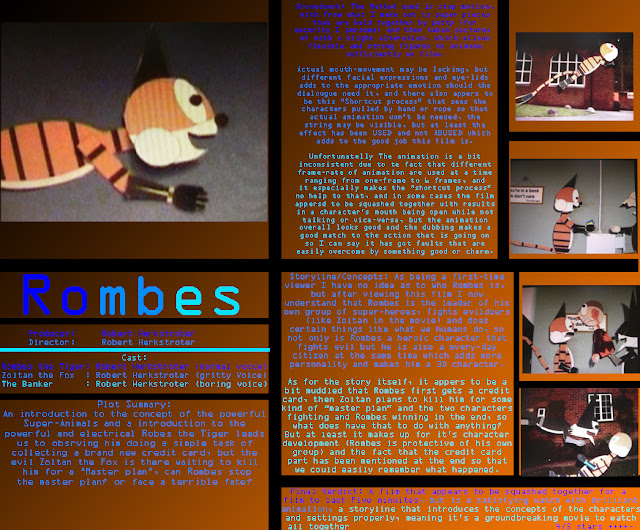 Yep, as clearly observed I am getting use to using Photoshop, with using shapes, a readable font for a small size to need to read it on this blog, different shades of blue to keep the reading of the review interesting, and using the merging of the colours Black and Orange (to imitate Rombes ofcourse) as the background, perhaps it could really benefit me in the future should I need it again.
May the Hype stand down.
Monday, 14 November 2011
Apologies + Real duration + Real deadline
Within this post, I like to apologise to the fact that there has hardly been a proper blog post during this time, I was planning to release the Target audience post but I accidentally deleted it which means that I will have a extra workload to re-construct it and post everything else on this blog.
But anyway, I have just been informed that the total duration of the movie is not 6:30 as originally said but instead 5:00, I think that the 6:30 was meant to be for the drafty while the 5:00 was for the final print, but my film was depended on the duration of 6:30 which could mean that the 5:00 version could be squashed a bit, but In exchange this gives me the opportunity to refresh the acting and the music to better standards, and to correct things that was incorrect with the draft version.
Also I have been informed that the final deadline of the overall media project from this blog to the Rombes film itself has to be on Monday 21 November 2011 and without any flexibility to hand it in at a later date, but I will make the final post on Sunday 20 November 2011 that complement what I thought of everything of this media project.
May the Hype stand down.
Thursday, 10 November 2011
Metrazort-The First Film For Media-Part 2
Examiners of the past may have been disappointed of the fact that the original full Metrazort film has not been uploaded (in fact, only 1/2 has), so here it is, thanks to embedded codes and a new YouTube account, I give you the media film that really got a going, this is the Metrazort film.
As much of a celebration as it sounds, the full reason why I uploaded the film onto the blog in the first place is to compare this film and it's production values to the new Rombes film.
The actors in the Metrazort film are great with their roles I must say, but the actors for the characters have been replaced due to the fact that the actors intended for the film could not make it one way or the other, and the actor of the Metrazort film is myself with a electronically disjointed voice.
But in the Rombes film, I am the only actor playing the voices, but different voices to differentiate the characters and thus the acting I intended could be accomplished in that film, plus as being the only actor and doing everything at once it is guranteed that production may commence without any problem whatsoever.
The animation in the Metrazort film and the Rombes film are relatively similar, due to the principle of animating with stop-motion something in front of different large pictures, but it is generally different from one another, due to the fact that the Metrazort film uses a full 3D figure with full articulation (with only the legs to be chopped off when shot close-up for stability) that is animated vertically in front of a photo held up by Lego pillars, while the Rombes film uses 2D characters with only the appropriate articulation on-screen (with body parts changed or replaced to express emotion or a different character view) that is animated horizontally on a photo on a table.
The editing of the Metrazort film I admit is choppy and slowish, and with different voices per takes (and without any dubbing) the voices appear to be disjointed, also there are some instances of a fade to black, thus making it a short film rather than a proper film opening like it should, but for the Rombes film, it generally works as a short film is suppose to work as there are a lack of "fade to black scenes" (except for one point, but it is more sufficient than the Metrazort film) and due to the dubbing and not the use of real actors the voices are less disjointed and thus has got a better flow while fast-pace editing is going on.
While making the Metrazort film I was quite concerned about using sound effects from other sources (so as not to infringe copyright) thus resulting in depending on diagetic noises, some piano noises I personally made and two sound clips from pinnacle (when the soldier if firing and when the Metrazort shoots it's laser) thus resulting in some blank moments and just some piano music to express the tone, while in the Rombes film the amount of piano music has increased which adds a lot more to the background and adds more interest, plus due to the diagetic part being impossible due to animation I added sound effects from pinnacle to add to the realism and action that is going on, thus having a film that has more sound to listen to other than the voices and raising your interest at the same time.
Finally as for audience, the original Metrazort film has got the gender split of 65% males to 35% females due to the interest of males for the army, action and the Metrazort itself while the females would be fascinated with the female Sergeant as well as the attraction of the film and would still be to the liking to to "boys in uniform" or "very strong characters", and the demographics are B (meaning a attraction to teachers and graphic designers that will be fascinated my my film) and D (due to the use of the military, the special effects and animation used and something to entertain that audience group).
In the meantime the Rombes film has got the gender split of 85% males to 55% females due to the rate of action that is going on with instances of blood and general violence in which only boys are interested in, but I admit that a few girls may be interested to due to the design of the character Rombes and being a general good thing to watch if they are willing to do so, but the demographics are similar to the Metrazort film presumably due to a near-similar film style, meaning that the general demographics are B (meaning a attraction to teachers and graphic designers that will be fascinated my my film) and D (due to the type of storyline, special effects and animation used and something to entertain that audience group), but it is also open to demographic E (due to the general low-budget to product this film and being entertaining for a time of unemployment (especially when it comes to killing off The Banker) and is quite likable to students who are doing media themselves) so the Rombes film is has got more audience range than the original Metrazort film.
So in conclusion, I may still be not ashamed of my previous Metrazort film, but as observed there there was a lot of improvements for the production of my short film due to having a higher production value, better voice acting and being more connected as to what it is suppose to be (a short film), but at least the Metrazort film does get some credit for contributing to the progression of my media studies in demonstrating improvement over time.
Monday, 31 October 2011
Metrazort-The First Film For Media-Part 1
If you look at this blog and compare it with my previous film blog (ROMBES) for marks of improvement, then it should be realised that there is allot of change between the storyboards between the films "Metrazort" and "Rombes", so this post itself will examine these differences.
Now as 6:30 minutes of the Rombes film compared to the 2:30 minutes of the Metrazort film, the amount of storyboard page is doubled to accommodate the extra length of the film for the Rombes film, but the Metrazort film is simpler to follow due to the less amount of storyboards.
What is observed if the storyboards are compared is the fact that the Metrazort Storyboard has got more perspective with angles and different sizes at a camera view, and due to the perspective of the Cartoon strip and how it's made, Rombes is only on one strict angle with different camera shots, but Rombes has got far more detail with the characters and far more colour than the Metrazort storyboards.
Both Storyboards has got information and speeches that are tied together with the action of the storyboard, giving better understanding on what is needed (and hence appearing that the storyboards and the script have merged), but the Metrazort Storyboards has got less information about where goes where and of the camera angles than the Rombes storyboards, meaning that there can be a bit of confusion, and it all depends on guidance from the pictures (which do not help at times due to the narrow school corridor), so I can get off track with that storyboard, while the Rombes storyboards show the opposite which results in better guidance not only with the pictures.
Finally is how the films are faithful to the storyboards, now during the production of the Metrazort film, the storyboard (aka script) has been forgotten on-set so I had to work with mind as to what the characters say and do, while Rombes still keeps the storyboard in place while in production.
The Metrazort film films the shots by order of the scenes with the Metrazort segments added later while Rombes shot the scenes in order of the photographs on a pile.
But overall, The Metrazort film is closer to the storyboard than the Rombes film, this is due to the fact that the Rombes film has some minor changes in the lines and several different actions, and a majorly different ending in the end.
So both may not be the storyboards found in reality, but they are quite useful for the films they provide, no matter the difference.
May the Hype stand down.
Costumes and Props
Due to the use of South-Park style animation instead of live action as it normally should be, answering the question on props is technically a difficulty due to the fact that almost everything is a prop when it comes to this film, but due to it being the criteria I will answer the best I can.
In this Slideshare are all the pieces cut out for the film, now some may not be actually in the film due to lack of use or impossible to use, but here it is, technically all of the parts for the film.
The pieces are first created using Autoshapes on Powerpoint as it is a useful construction tool that I am personally most familiar with and giving me alot of time to save by copy and pasting things, then printed on real A4 paper and not ordinary paper to add to quality and to be sure it lasts long enough while filming, then cut out at the finest cutting I can do (My mum helped me with the cutting too) so as not to leave a piece of paper edge on the pieces to that it less fake as it can be.
Now the character used in the film is called a model, due to the fact that all the parts on-screen represents a character on film, plus I really call it so due to all the separate parts secured together or on the background by the use of putty (easy to animate then to fumble with the parts, and to make shortcuts to move the character than to animate), and the basic format of the overall model is Eyelid-Pupil-Head-Body-Upper Arm-Lower Arm-Upper Leg-Lower Leg-Tail (at different joints).
Now to change a emotion of the character from the side-view, there are different eyelids to stick on over the eyes and adding the pupil on top, and the overall mouth is accomplished by switching the heads on the model while animating to simulate the changing of a emotion.
And to change a expression while with the front view I simply change the eyelids, but these particular eyelids are exclusive to the front view due to the fact that they are circles rather than ovals, and to change the mouth I just simply switch mouths rather than use a different head, therefore you can assure that the front-view head is the same head.
Now as observed I only work with a quarter perspective meaning that you can only see a side view, the front and another side view, now parts are designed to be specific to a certain view so as not to confuse audiences by not using the same parts for a different view or to make them bored with the same sort of view over and over again, and to simply change the views I just switch the parts for ones to represent that view.
But aside from that, special parts have been made for a task that is specific scene or situation (e.g. when Rombes' chest was slashed, I changed his body to a different body contains a detail to tell that he has been cut) plus extra detail is added on the special parts by using a colouring pencil to add in more detail once it has printed (however shows like South Park uses different part rather than change then like I did), also are different scale models of Rombes (but not Zoltan) to match the portions of a particular scene, but the smaller model planned for use on the opening is too small and thus has been aborted, and the larger model has only been in two shots of the film overall (when Rombes is walking towards you and when Rombes is in front of the power generator).
Several items have been made at the same time also for the characters to interact (e.g. the credit card or the bank door)with or to provide something special for the character (e.g. the two triangles that represent Rombes flying at super speed), and at one point the Window of the bank changed to represent a smashed window to add simulation of reality, all this is to add interest to the audience similar to as to how South Park did it.
So that is all the paper cutouts covered from inch to inch, now is the photographic background itself, which is very unusual compared to South Park but adds to more realism and the fact that I don't have to create the backgrounds.
All the photos seen in the Slideshare you've seen are the photographic backgrounds seen on the film, now to accomplish this simple task, first you take high-quality photos with a professional camera (in Windsor and The Windsor Great Park Village) then you print them all on high quality colour by use of a A1 printer so that it is large enough to make characters and parts that are easy to animate by size, then all the photos are labeled by number so that I can use them in order of number to add to simplicity (however at the cost of continuity due to different expressions or poses from one photo shot to the other), then you secure them on the table by use of putty and then you animate the characters in front of them.
Doing the photos was an easy task (especially when it comes to The Windsor Great Park Village), but for the bank interior I planned to photograph the inside and the outside, but the inside was absolutely forbidden due to security issues and I am afraid that they could say the same with the outside, so I made a picture of a house, added a large window from PowerPoint and a large logo to parody Barclays (as in calling it Barkleys) and there is the Exterior, now the interior is exclusively made by using autoshapes from PowerPoint, and using the 3D feature on powerpoint to make the background colour appear as a room, now this may be the most unrealistic background in the film due to lack of proper detail, but It also is applied to my own cartoon strip too so it adds to mare faithfulness to the source material and is a good substitude to a real interior of a bank, so here is the slideshare of whe bank Exterior and interior to demonstrate what I am talking about.
May the Hype stand down.
Beat With Beat (My magazine interview)
As most people know, Rombes is actually a Cartoon Strip consisting of stories (adventures) created by myself, but did you know that before the film was made, I had an interview with Beat's interviewer Cynthia Barlow Marrs (with many good credit to her) and I told her all about Rombes and what the strip is like, so in case you are curious of the original source material, click on the link to find out more of Rombes.
http://www.beatmagazine.co.uk/interview-with-robert-herkstroter
I hope that you understand, and May the Hype stand down.
http://www.beatmagazine.co.uk/interview-with-robert-herkstroter
I hope that you understand, and May the Hype stand down.
The Missing Ending
Anyone would have thought that I would have completed the story board (and overall concept of the film) that would act as a guide to help me direct my film, but while making the film, despite a few minor changes I have realised that there was one major fault and that was the ENDING.
Yes the Ending itself, and if you looked though the Slideshare presentation then the ending should have been that Zoltan (The Black Fox) would have came out of the explosion dazed, then a slight joke from Rombes, but then it comes back to the "Master Plan" where Zoltan teleports away and Rombes flying off with determination to find Zoltan and crush his master plan (to make the audience curious).
But on first sight the production manager is concerned with the ending, so persuades me to add a ending narration (or speech by Rombes)to persuade the audience that Rombes will win in the end, and a extended part for Rombes to try to stop Zoltan before he teleports away but fails.
But there are allot of problems in the production, a model for a Burned-Up Zoltan has accidentally been forgotten, too many errors were made while making that sequence and there can be a few limitations with Pinnacle so it is not easy to make Zoltan teleport away (and I forgot a shot to allow a transition effect to take place).
Apparently I was getting nutty while finishing off that sequence, but the overall problem that made me realise that there is something wrong is the length: the movie is meant to be 6 minutes and 30 seconds and the ending is too long and cannot be shortened and the film needs room for the credits and logo.
So if you viewed the video, the solution taken in the end was to change the ending (shown from that tip of the storyboard to the official modification), because not only was the production of the original ending faulty, but also to get a more positive ending, a shorter ending and more positive reaction from the production manager and the audience in general, it may be the usual sort of ending, but it is worth it.
The new ending itself is recycled footage from the middle of the film heavily modified with a title effect from pinnacle (note the colour of Zoltan's cell similar to the bank) and Rombes flying off is from the original ending itself, but all two factors received new audio.
Before calling off, two still clips of the original ending will be present in the credits at the end of the film.
May the Hype stand down.
Friday, 21 October 2011
The other tries with Photoshop
Aside from the music CD cover, and the Movie review from The NeverEnding Story, there have been two tries with Photoshop which I had to do, and the reason to do it was so that I could develop my skill for when I'm going to do the film review on Photoshop.
And the answer was the fact that it was a success, but how did the two tries help me to create a good film review?
I hope that you can see the potential those to tries have taught me to how to make a appropriate and good film review.
May the Hype stand down.
And the answer was the fact that it was a success, but how did the two tries help me to create a good film review?
 |
| The first try was to try and make a Magazine cover for gardening, which is mainly the modification of shapes and text and to use them appropriately, and I think I did a good job with it, especially with making the concept of the overall magazine sound absurd with it being similar to a beauty magazine. |
 |
| The Second try was to either create a movie cover or experiment with effects, but no matter I used several effects like the burn tool to accomplish this piece, which is a car seemingly targeted by a train, I really learn allot from skills and lessons like this. |
May the Hype stand down.
Film Review part 3/3:The grand review
Here it is, the official review of "The NeverEnding Story" all looking neat, crisp and tidy.
You may note the fact that some pieces of information has been shortened due to the format size of the review, but It still presents the same appealing information none-the-less which makes it a jewel itself in my skills of using Photoshop (yellow borders, brown background, pictures and letters).

May the Hype stand down.
You may note the fact that some pieces of information has been shortened due to the format size of the review, but It still presents the same appealing information none-the-less which makes it a jewel itself in my skills of using Photoshop (yellow borders, brown background, pictures and letters).
May the Hype stand down.
Storyboards/Scripts
The first thing noted on this post is "where is the script?"
Well the answer is the fact that I work in a different way, and I cannot technically have two sources to guide me through my film (and the fact that no-one else is working on my film with me) so to save time and effort so that I can carry on with more things to do with media (and the other WBS subjects) I have merged the Storyboards and Script into one, so that I have one source material to guide myself on what I'm doing and not the muddle up of two.
But despite this, there have been a few changes due to limitations and the need to extend or decrease things a little, so I will list all of the changes as well.
The overall big change is the fact that Rombes has got battle armour with blades like Zoltan, and not the ninja stars seen on the storyboards.
Originally, I was instructed to make the character "family friendly" so instead of the blades seen normally in the strip I used ninja stars to accomplish this, and I gave the blades to Zoltan instead of his cannon to be meaner, but the ninja stars was rejected and unlikable so I switched back to the blades (but Rombes still won't use them in the film like the vicious Zoltan would).
And due to the effects on pinnacle it may not be possible for the characters eyes to light up.
Page 15: Originally Zoltan would crash by where the desk is and it would cut to Rombes saying "there will be no throat slashing today Zoltan" but it has been changed into Zoltan flying away BEHIND the desk and Rombes landing on his feet, also the line will be changed to "I will not stand for the injustice of your master plan Zoltan" to be sure that the audiences get that Rombes is good and Zoltan is evil.
Page 16:Would have been Rombes flying completely out of the window, but due to insufficient photos to do so I made him fly out of the window by the same photograph he came and entered to the bank (hence why he will fly from the window to the left of the screen).
Page 22:The other half of Rombes' torso would have kicked Zoltan's @@@@@, but it was deemed not funny, so I changed it to a electrical shock from the tail (and thus giving the tail a better purpose anyway).
Page 29:Would have seen Zoltan all grizzled and grey from the blast, but the paper cutouts from such have been forgotten, but will still act in a daze
Page 30:Instead of a simple sequence of Zoltan getting away and afterwards Rombes realises, Rombes will realise while Zoltan is teleporting away and would try to stop him to add more heroism and less stupidity to Rombes.
Page 32: A more encouraging speech will replace the one seen from Rombes to persuade the audience that he will win in the end, and the narrator joke at the very last panel will be omitted.
May the Hype stand down.
Risk assessment
What is to see on this blog post is the risk assesment, all written out and precisely understood as to what the dangers are while conducting my film.
But I confess the fact that I am doing a animation rather than live action (despite one brief moment of it) meaning that the disasters are minimal, meaning that it is a safe film to conduct and make.
But this is what I can figure out (note the early working title which is "Rombes-the master plan part 1" but the title has just been simply changed to "Rombes").
May the Hype stand down
But I confess the fact that I am doing a animation rather than live action (despite one brief moment of it) meaning that the disasters are minimal, meaning that it is a safe film to conduct and make.
But this is what I can figure out (note the early working title which is "Rombes-the master plan part 1" but the title has just been simply changed to "Rombes").
 |
| The Risk assessment |
May the Hype stand down
Film Review part 2/3:Drafting the ideas
On the second part to create a film review/film review format, I made a draft before making it on Photoshop, so that I get the general idea on what I best need for the overall task.
May the Hype stand down.
 |
| The Draft itself, note the information and pictures stuck on to get an idea as to where the pictures and information I made earlier is suppose to go for better arrangement, in order first is the huge picture, then the huge title, then the director/cast/release dates, then plot summary, then groundwork, then story/fantasy elements, then the final verdict of the film and the star rating system (which is five stars). |
 |
| With the information and pictures folded, you may note the observation of the design style with thick yellow borders and one huge picture of Falkor the luckdragon at the beginning, meaning that I ultimately got the idea of what a review should look like, but the colours on the review will be very different compared to this colour (hence the result of pink cut-out paper. |
 |
| The drawing of Falkor I made, obviously to represent the first picture to gain people's attention, equal to the tactic of the large title in bold/large size. |
Subscribe to:
Posts (Atom)